Best Bikini Colors for Your Skin Tone: 2026 Picks
The best bikini colors for your skin tone aren’t the ones trending on TikTok — they’re the ones that make your skin look brighter the second you put them on. Stand in front of a mirror with a fuchsia bandeau and the right one will make your eyes pop and your cheeks pick up natural color. Wear the wrong one and you’ll spend the whole vacation thinking you look tired in every photo. That single shift — matching the swatch to your undertone instead of the trend cycle — is what separates a bikini you wear twice from one you live in all summer.
How to Find Your Skin Undertone First
Before you even open another swimwear tab, you need to know your undertone. Skin tone is the surface shade — fair, medium, deep. Undertone is the color underneath, and it doesn’t change with a suntan. Stylists at Pantone’s color institute group everyone into three families: cool (pink, red, or bluish hints), warm (peachy, golden, or yellow hints), and neutral (a mix of both, or no clear cast either way).
The fastest test takes 10 seconds. Walk to a window with natural light, flip your wrist over, and look at the veins. Blue or purple veins point to a cool undertone. Green veins lean warm. If you can’t tell which dominates, you’re likely neutral — and you can get away with almost anything. Jewelry is the second clue: silver flatters cool undertones, gold flatters warm undertones, and rose gold sits neutral.
One more check: how does your skin react to sun? Skin that burns first and tans red usually runs cool. Skin that tans deeply and quickly tends to run warm. Knowing this once means you never have to second-guess a swimsuit purchase again.
Best Bikini Colors for Fair, Cool Skin
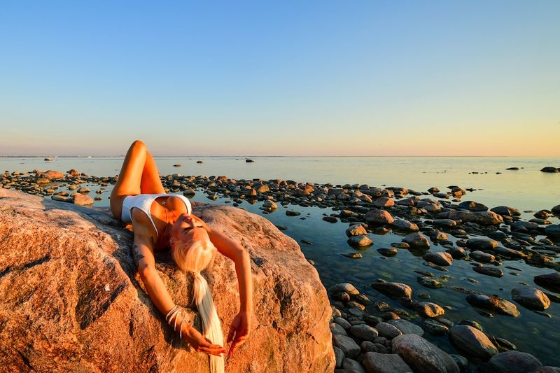
Fair skin with a cool undertone glows next to clear, saturated colors — the kind that have blue underneath them rather than yellow. Think sapphire blue, emerald green, raspberry pink, true red (the cherry-Coke red, not brick), and cool lavender. These shades create contrast against pale skin without washing it out the way beige or pastel yellow can.
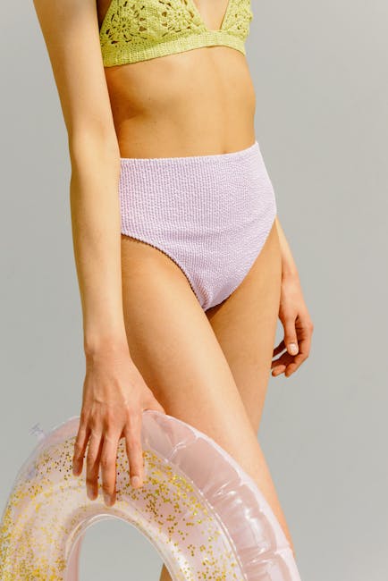
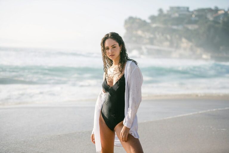
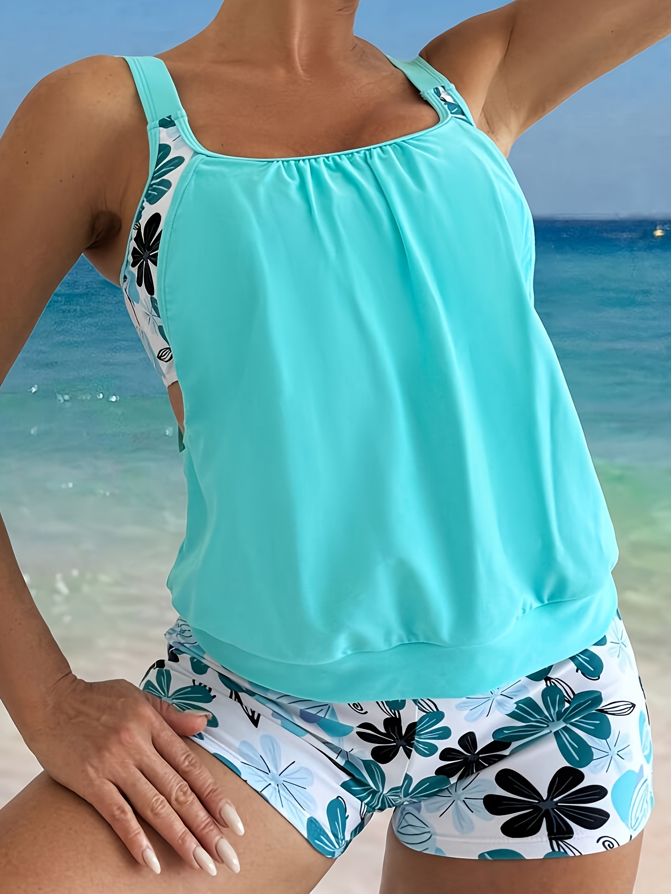
Black works, but in the right cut. A black halter or one-piece reads sleek on cool fair skin, while a flat black string bikini can look severe in harsh sun. Soften it with a silver-ring detail or a subtle pattern. Crisp white is another safe pick because it mimics the high contrast that suits cool skin — just check that the fabric isn’t see-through in pool water before you commit.
The shades to avoid? Anything muddy: olive, mustard, camel, salmon, beige. They share warm undertones with your skin and can make you look flushed or, oddly, pale at the same time. If you love earth tones, pick the cooler version — forest green over olive, burgundy over rust.
Best Bikini Colors for Warm, Golden Undertones

Warm undertones — the peach, gold, or honey-cast skin that tans beautifully — come alive in colors that share their yellow base. Coral, tangerine, mustard, terracotta, warm burgundy, and any shade of green that leans toward chartreuse or olive will make warm skin look sun-kissed even on day one of vacation. Browns become a hidden weapon here: a chocolate or caramel bikini reads expensive against golden skin in a way that bright neon never will.
Earthy reds work better than fire-engine reds. A rust or brick bikini photographs gorgeously against warm skin, while a cool blue-based red can fight with your undertone. The same logic applies to pink — salmon and peach win over hot fuchsia.
White is trickier. Bright optic white can wash out warm undertones because it lacks the yellow your skin has. Switch to off-white, cream, or ivory and the same outfit suddenly looks luminous. This is the single easiest swap most warm-toned women make on a beach trip, and it changes every photo for the rest of the week.
Best Bikini Colors for Olive and Medium Skin
Olive skin is the chameleon of the undertone world. It can pull warm in summer light and cool under fluorescent dressing room bulbs, which is why so many olive-toned women feel like nothing in the rack works. The trick is to lean into the green-gold cast instead of fighting it. Turquoise, teal, deep jade, marigold, rust, and dusty pink all flatter olive skin because they create the same contrast the skin already carries in its own pigment.
Burnt orange and copper are sleeper hits. They make olive skin look freshly bronzed and read more like a styling choice than a color choice. If you want a clean print rather than a solid, look for batik-style turquoise-and-cream or a watercolor coral. The pattern gives the eye somewhere to settle while the color does the work on your complexion.
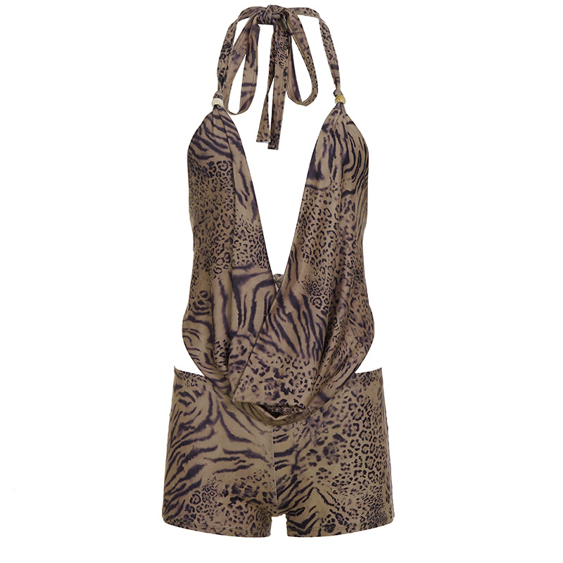
Medium skin without strong olive undertones — think a light tan that holds its color year-round — gets a wider palette. Almost any saturated color works here, which is part of the reason this range looks great in classic prints like leopard and stripes. The colors to skip are pale pastels with no warmth — baby pink, soft mint, sky blue — which can flatten out medium skin and make it read sallow.
Best Bikini Colors for Deep, Rich Skin Tones
Deep skin tones have the widest color range of any group, and yet they get the smallest selection on most swimwear sites. That’s a sourcing problem, not a styling one. The truth is, deep skin glows next to almost every bright color in the spectrum, especially the ones designers tend to bury at the bottom of the page — hot pink, sunshine yellow, royal blue, cobalt, electric orange, and emerald green.
Whites and pale neutrals look gorgeous because they create maximum contrast. Crisp white, cream, soft yellow, and pale gold all push the skin’s natural luminosity forward. Metallics — especially gold and bronze — bring out warm-cast deep skin in a way other materials simply can’t.
The mistake to skip is muddy brown or dark olive. These shades sit too close to your own depth and end up making everything blend together. If you want a brown, make it a saturated chocolate or a warm caramel, not a flat khaki. The same goes for navy: a deep, clean navy works beautifully, while a washed-out steel blue can fall flat.
For body-positive style inspiration on solid color blocking, our take on halter bikini styles and fit covers the cuts that pair best with these saturated shades.
Jewel Tones, Pastels, and Neutrals — How They Work on Every Body

Jewel tones — sapphire, ruby, emerald, amethyst, topaz — are the closest thing swimwear has to a universal flatterer. They have enough saturation to read on every undertone and enough depth to avoid the chalky look pastels can take on in bright sun. If you only invest in one statement bikini this summer, a jewel-tone piece will outperform a pastel or a neutral nine times out of ten.
Pastels are where most people get tripped up. Soft pink, baby blue, mint, and butter yellow can be stunning, but they have a narrow window. They suit cool, fair skin and deep skin best because they create real contrast with both. On warm, golden, or olive skin, the same pastels can disappear into the complexion. If you love a pastel and your skin is warm-toned, look for one with a clear contrast trim — a tan body with white piping, for example — so the eye still has somewhere to land.
Neutrals — sand, taupe, mocha, soft black — deserve more respect than they get. They’re the colors you keep wearing for years because they go with every cover-up, every sunhat, every hotel poolside. The styling rule is simple: pick a neutral with a strong tonal contrast to your own skin. If you’re fair, go darker. If you’re deep, go lighter. If you’re in the middle, lean into the saturated browns and warm taupes rather than chalky beige.
Our breakdown of trending colors and patterns for 2026 shows where current jewel-tone and neutral palettes are heading this season — useful if you’re trying to match the year’s aesthetic without sacrificing what flatters you.
The 60-Second Color Test Before You Buy
Online shopping makes this harder. Phone screens shift color, lighting in your bedroom is rarely the same as outside, and what reads emerald on a model might look swamp green in person. There’s one cheap workaround that takes less than a minute.
Hold the fabric up to your face in natural light — never in a dressing room with overhead fluorescents. Look at three specific things. First, does the under-eye area look brighter or darker? A flattering color lifts shadows. The wrong one deepens them. Second, do your lips look fuller and pinker, or do they read pale and washed out? Third, do you see your jawline clearly, or does the color blend it into the background? A color that flatters you will sharpen your features without you doing anything else.
Photograph yourself in two different colors back to back if you’re torn. Don’t pose. Just hold the fabrics up under the same light and compare the photos. The right one is obvious within five seconds — your eyes go to your face, not to the fabric. That’s the bikini.
The 2026 styling cycle leans heavily on hot hues and bold prints, and the same color-test rule applies whether you’re looking at a solid raspberry or a tropical print — check the dominant color against your face, not just the photo on the product page.
Color Mistakes to Skip on Every Skin Tone
The most common mistake isn’t picking the wrong color — it’s buying a color you saw on a model who looks nothing like you and assuming it’ll translate. The Vogue Business swimwear report flagged this in 2024: roughly 60% of returned swimwear gets sent back because the color didn’t suit the buyer the way the model shot suggested. The fabric’s fine. The fit’s fine. The color just isn’t for you.
A second mistake is treating your tan as permanent. Skin that’s freshly bronzed can handle bolder oranges, golds, and earth tones than skin that’s lighter in winter. If you’re buying in February for a July trip, factor in where your color will actually be on vacation. Build a small mix — one bright, one neutral, one earth — and you’ll never be stuck.
The third mistake is letting current trends override personal coloring. The 2026 forecast from WGSN and Pantone keeps pushing aquatic blues and watermelon corals, and those shades do look beautiful — on the right skin. If your undertone fights the trend, scale it down: a watermelon-coral tie or strap detail on a coral piece will give you the seasonal nod without dressing your whole body in a color that doesn’t serve you.
One last note on confidence: the color that flatters you most is the one you stop thinking about the moment you put it on. If you spend the day adjusting straps, second-guessing photos, or pulling a cover-up over yourself, the color is fighting you. Switch it. Life is too short to wear a bikini you don’t love.
Watch: How to Find the Best Colors for Your Skin Tone
This video walks through the same undertone test we covered above, with side-by-side comparisons so you can see how the same person reads completely different in cool, warm, and neutral shades. Useful if you’re a visual learner and want to confirm your undertone before you shop.
Sources
- Pantone Color Institute — Understanding Undertones — The cool, warm, neutral framework used throughout this guide.
- Vogue Business — Why Swimwear Returns Are Spiking — 2024 industry report on color mismatch as a top return reason.
- WGSN — Color & Fashion Forecast 2026 — Source for aquatic blue, watermelon coral, and jewel-tone trend calls.
Shop our full range of bikinis and swimwear at the BikiniCool store →