
Mix and Match Bikini: 7 Pairing Rules That Always Work
Mix and match bikini separates have been around for decades, but they’ve never been more useful than they are now. The average woman is a size 4 on top and a size 8 on the bottom, and most bikini sets are cut as if those two numbers always align — which they almost never do. Buying a mix and match bikini means you’re no longer betting that one brand’s sample size matches yours. You get the top that fits and the bottom that fits, and the look is often sharper than a matching set would have been anyway.
That said, throwing together random tops and bottoms rarely produces the intended effect. Color, coverage, proportion, and fabric weight all factor in. There’s a clear difference between a combination that reads as deliberately styled and one that just looks like a grab-bag. The seven rules below cover the full range — from color logic to print mixing to building a wardrobe that gives you thirty-plus looks from ten pieces.

Start With Solid Colors — The Foundation of Every Great Mix
Solid-color pieces are the anchor of any mix-and-match wardrobe, and the reason is simple: they work with almost everything. A plain black, navy, sage, or terracotta bottom can rotate through a dozen different tops without ever looking repetitive. Solid pieces behave like neutrals — they let a printed or textured top carry the visual interest without competing for attention.
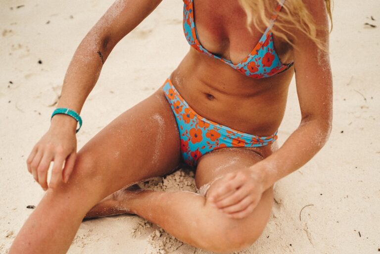
The reverse is equally true. If your bottom has a bold print — stripes, florals, abstract shapes — your top should be a solid that pulls one color directly from that print. The top doesn’t have to match perfectly; it just needs to belong to the same color story. A coral floral bottom pairs cleanly with a warm dusty pink top, not because they’re identical but because they share a temperature and a tone.
Start with three solid bottoms in different cuts — one high-waist, one standard rise, one cheeky. From there, your top options multiply dramatically without any additional effort.
Color Pairing Logic That Actually Works
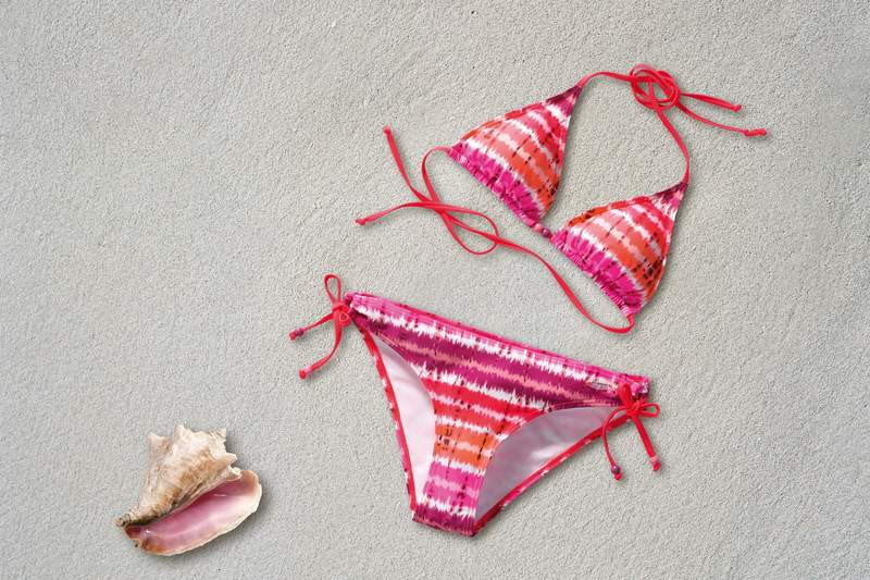
Matching the same color across your top and bottom is the most common approach, and there’s nothing wrong with it. But the combinations that turn heads at the beach — and photograph well — usually follow a different principle: complementary colors.
Complementary pairs sit on opposite ends of the color wheel. Orange and teal. Pink and green. Yellow and violet. The reason they work in swimwear is contrast: when two colors are complementary, each makes the other appear more saturated and vivid. An orange top with teal bottoms doesn’t just look coordinated — it looks intentional, even striking.
Analogous pairings — colors that sit adjacent on the wheel, like coral and blush, or sky blue and mint — produce a softer, more cohesive effect. These combinations read as deliberately coordinated without being matchy-matchy. Both approaches work; the key is choosing one rather than defaulting to whatever you grabbed first.
For this season’s most flattering color combinations, our guide to best swimwear colors for summer 2026 is worth reading before you shop.
Match Coverage Level Before Anything Else
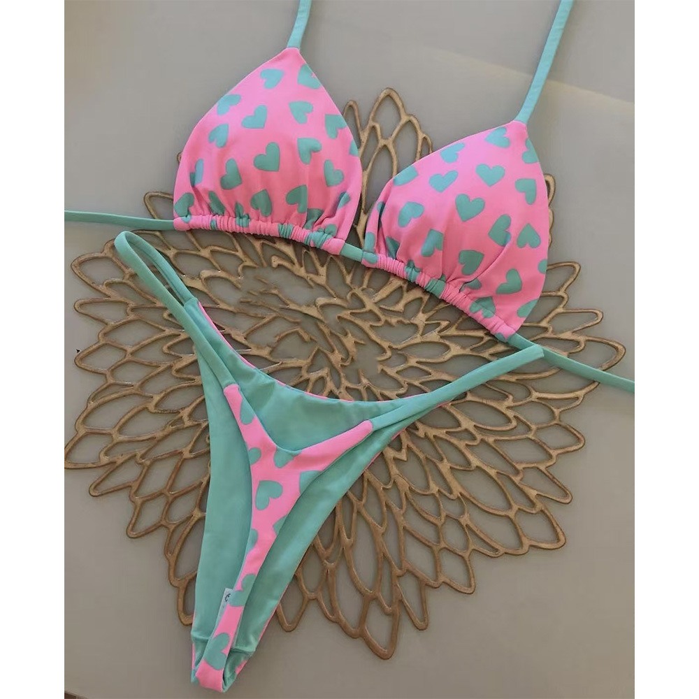
This is the rule that most style guides skip, and it’s the one most responsible for mix-and-match attempts that fall flat. Coverage level needs to stay consistent — or at minimum, follow a clear visual logic — or the look reads as accidental rather than styled.
A high-waist bottom is structured and takes up significant visual space on the torso. Pairing it with a tiny triangle top creates an imbalance where the bottom dominates and the top disappears. The solution is either a fuller-coverage top (longline bralette, bustier-style) or a second bold element on top — a strong color, a dramatic neckline — that gives the look balance. A cheeky or regular-rise bottom, by contrast, leaves the torso open, which makes most tops work.
For body-specific coverage guidance — particularly if you’re working with specific proportions you want to highlight or balance — our piece on bikinis for a rectangle body shape covers the principles in detail, and many of those rules apply across body types when it comes to proportion.

Three-Piece Sets Make Mix-and-Match Effortless
A three-piece bikini set typically includes a top plus two different bottom cuts — a standard pair and a cheeky or high-waist option. Every piece was designed to work together in color and fabric, but you get two different silhouettes from one purchase.
Buy two three-piece sets with complementary colors and you immediately have four tops and four bottoms that work across multiple combinations. That’s a potential wardrobe of sixteen looks from two purchases. The math is hard to argue with.
The selection criterion is simple: the two sets should share at least one color or a tonal relationship. Two sets built around warm tones (terracotta and coral, for instance) will mix freely. Two sets with no visual connection — one in jewel tones, one in pastels — will produce combinations that look genuinely random.


Mixing Prints: The Scale Rule That Solves Everything
Print mixing has an undeserved reputation for being complicated. The entire principle reduces to one rule: vary the scale.
A large tropical floral on the bottom pairs with a thin stripe or tight geometric on top. A bold leopard print on top works with a smaller, more restrained floral on the bottom. When two prints are the same scale — two chunky florals, two wide stripes — they compete, and the look becomes visually exhausting. When the scales differ, the prints complement each other instead.
The second requirement is a shared color. The prints don’t need to match, but they need at least one connecting color, even if it’s just a neutral. A red-and-white stripe top with a multicolor floral bottom works if the floral contains red. Remove the red and the same combination looks accidental.
Stripes are the easiest print to mix with anything, because their regularity gives them a neutral quality. If you’re new to print mixing, start with a stripe and layer from there.

Common Mix-and-Match Mistakes Worth Knowing
Mismatched fabric weight is the most common error and the hardest to diagnose in a fitting room. A thick, structured fabric on top — boned cups, heavy spandex — paired with a thin, drapey bottom creates a visual disconnect that looks unfinished. Pieces from different brands can vary significantly in fabric weight even when they look similar on a hanger. When in doubt, hold both pieces together and check that they feel like they belong to the same category of garment. A structured underwire top and a delicate string bottom aren’t in the same category.
Tie hardware is a detail that catches the eye more than most people expect. Gold hardware on one piece and white fabric ties on another creates visual noise, particularly in photos. Look for pieces where the hardware style matches — or choose pieces where the fastening is minimal enough that it doesn’t register as a mismatch.
Buying without testing the combination is the most expensive mistake in mix-and-match shopping. Two pieces that look great individually can create a proportion problem when worn together, especially when one piece is a high-waist bottom that hits at an unusual rise point. If you’re ordering online, use return windows aggressively and keep notes on what specific combinations worked. A combination that doesn’t work on your body isn’t a pairing failure — it’s useful data about which cuts you actually need for each section of your wardrobe.
Finally, don’t overlook the elastic. As swimwear ages, elastic degrades at different rates in different brands. Mixing a new top with older bottoms often shows a contrast in color intensity — the new piece looks brighter, the old one faded. Mix new-to-new or old-to-old, and when a piece starts to visibly fade, retire it from rotation rather than pairing it with fresher pieces.

Building a Wardrobe That Gives You 30+ Looks From 10 Pieces
The practical goal of a mix-and-match swimwear approach isn’t variety for its own sake. It’s efficiency: faster decisions at the beach, easier packing for trips, and never ending up with a bottom that fits and a top that doesn’t.
A functional starting wardrobe built around separates looks like this: three solid-color bottoms in different cuts (high-waist, standard, cheeky), two printed bottoms in different print scales, four tops (two solid, two printed in different scales and colors that connect back to your printed bottoms), and one cover-up or wrap that ties everything together visually. Ten pieces. The combinations available, when the pieces are chosen with a shared color story, easily exceed thirty.
The color story anchor is the part most guides leave out. Choose one color that appears in at least two-thirds of your pieces — not identically, but in the same temperature family. Cool tones (blues, greens, purples, cool pinks) or warm tones (reds, oranges, yellows, earthy neutrals). When your collection stays within one temperature, random combinations almost always look intentional rather than thrown together.
A practical way to test whether your wardrobe is well-chosen before you buy: lay out all the pieces you’re considering on the same surface and count how many pairings look immediately good without adjusting anything. If more than half the combinations work on sight, the wardrobe is well-calibrated. If fewer than a third work, you’re missing a connective color or you’ve chosen pieces in too many different temperature ranges.
The other advantage of buying separates is sizing flexibility across categories. A size large in one brand’s bottoms may fit identically to a size medium in another brand’s — and that’s fine, because no one sees the tags. The only size that matters in a mix-and-match wardrobe is the one that fits the specific piece on the specific part of your body it covers.

Sources
- Glamour — How to Mix Prints — Fashion editor guidance on scale variation and print pairing fundamentals.
- Refinery29 — Swimwear Styling — Stylist-sourced swimwear coordination advice, including mix-and-match strategies.
- InStyle — Swimwear — Capsule wardrobe and color-story building strategy from fashion editors.