2026 Bikini Color & Pattern Forecast: Shades Taking Over the Beach
After a few seasons dominated by sandy neutrals and millennial-safe black, 2026 swimwear is turning the volume back up. Designers are leaning into color the way they did in the early 2000s, only with a softer, more wearable filter on top. If every bikini wall at the beach store has started to blur together for you, this is the year that changes. The trending colors and patterns 2026 has lined up are bold without being costume-y, and they’re being cut to flatter real bodies — not just sample sizes. Here’s what’s actually moving the needle for the upcoming beach season, and how to wear any of it without overthinking.
Why 2026 Is a Color Reset Year
Two things are pushing color back to the front. First, the wider fashion world spent the last two years in a quiet-luxury phase — beige, taupe, oatmeal, cream. People are tired of muted. Color sells right now because it feels like permission to enjoy clothes again. Second, sustainability conversations have shifted toward keeping pieces longer, which means swimwear buyers are willing to invest in something they actually remember owning. A plain black triangle top is forgettable; a butter-yellow halter you pull out every July is not. Both factors mean brands are taking more risk on bright hues and statement prints than they have in five years.
The Five Trending Color Families for 2026
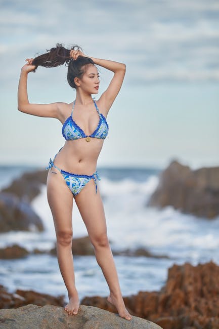
Buttercream and Soft Citrus
The “it” yellow of 2026 is not the searing neon of 2018. Think soft butter, melted lemon sorbet, faded sunshine — yellows that read warm rather than electric. They flatter a wide range of skin tones because they sit on the warmer, creamier side of the spectrum instead of going sharp and acidic. Pair them with white linen cover-ups or natural straw bags and the whole look feels effortless. If yellow has always felt risky on you, this is the season to test it; the muted version is far more forgiving than its predecessors, and it photographs beautifully in both bright midday sun and golden hour.
Shop Yellow Bikini Sets on Amazon →
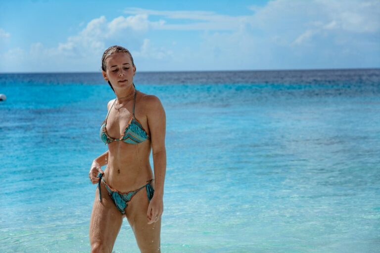
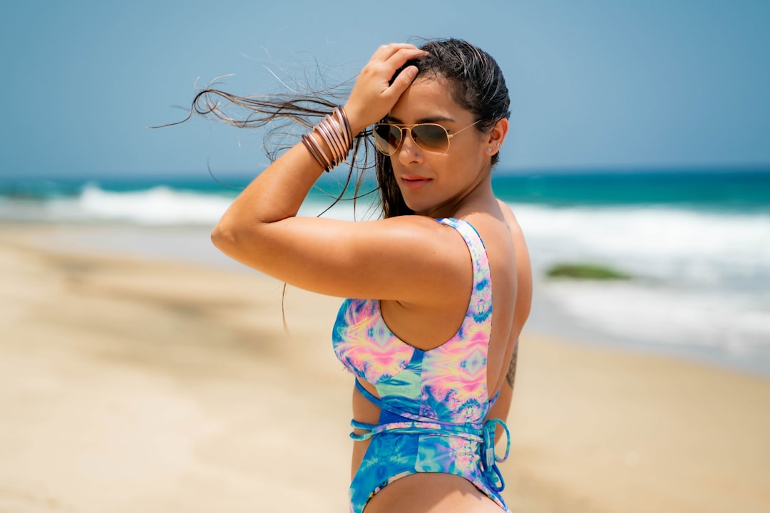
Aquatic Greens
Greens have been creeping into swimwear for two seasons, and 2026 is when they take over. The shades to watch: sea glass, faded teal, deep aquamarine, and a soft sage that almost reads like gray in flat light. These greens photograph beautifully against both sand and pool water, which is part of why content creators have been driving demand. Aquatic greens also play well with gold jewelry, making them a natural pick if you wear a lot of layered chains or hoops to the beach. They’re a safe entry point for anyone curious about color but nervous about jumping straight to a brighter shade.
Warm Terracotta and Clay
Earth tones aren’t going away — they’re just getting warmer. Pure beige is being replaced by terracotta, rust, brick, and clay. These tones drape beautifully on warmer undertones and create a flattering contrast on cooler complexions when paired with a hint of gold hardware. The advantage of terracotta over true red: it photographs softer, doesn’t compete with the rest of your outfit, and works in early morning and golden-hour light without looking washed out. It’s also one of the most travel-friendly shades, since it reads polished even after a few days in a suitcase.
Sun-Faded Pastels
Pastels are coming back, but not in their cupcake form. The 2026 pastel reads sun-bleached — like a beach towel that’s been through three summers. Dusty pink, faded lavender, hazy mint, washed periwinkle. These shades flatter just about everyone because they sit at low saturation, which means they don’t overpower the wearer. If full bright color feels like too much commitment, sun-faded pastels are the easiest entry point. They also layer beautifully under sheer cover-ups, which is part of why resort brands are pushing them so hard this year.
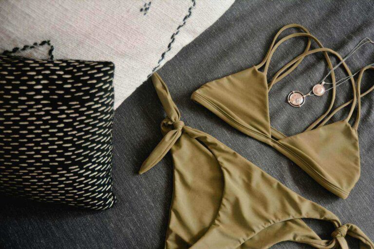
Deep Wine and Berry
For anyone who has been waiting for a darker color story, wine, berry, plum, and oxblood are the standouts. These shades push back against the assumption that summer must be light. They’re rich, they slim where you want them to, and they look striking against tan, pale, deep, and golden skin tones alike. Wine is also a smart pick for swim-to-dinner pieces, because it transitions into the evening better than any tropical brights ever could. If you’re someone who loves the look of a little black bikini but wants something slightly more interesting, a deep wine is the easiest swap.
Shop Wine & Berry Bikinis on Amazon →
Patterns Defining 2026 Swimwear
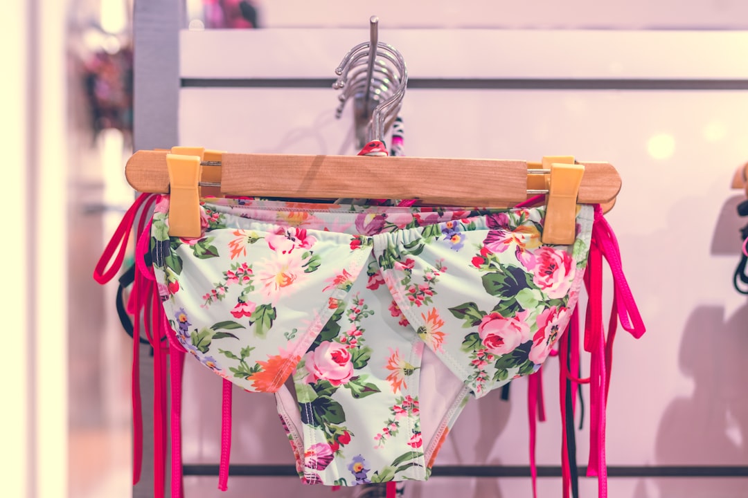
Watercolor Florals
Bold, graphic florals are out. Watercolor florals — soft-edged, hand-painted-looking blooms — are in. They feel romantic without being overly girlish, and the blurred quality of the print is naturally flattering because the eye doesn’t lock onto any one hard line on the body. Look for two-piece sets where the same watercolor print is treated slightly differently on the top and bottom; that subtle variation gives the suit a custom feel and makes it easier to mix with other pieces in your wardrobe later.
Crochet-Inspired Prints (Without the Crochet)
Crochet styles have been everywhere, but 2026 introduces a printed version: bikinis that look like crochet from across the beach but are actually printed Lycra. These are easier to care for, dry faster, and don’t sag when wet. The print typically reads as cream or soft beige with darker thread-pattern lines, giving the boho aesthetic without the maintenance commitment. It’s a smart pick if you love the look of crochet but have been burned by a real one stretching out after one ocean day.
Marbled, Tie-Dye, and Liquid Prints
Tie-dye never fully leaves swim, but 2026’s version is more sophisticated. Think marbled patterns, ink-in-water effects, and slow-blended ombré that looks closer to a watercolor wash than a tie-dye shirt. These prints are inherently flattering because they break up the silhouette in ways solid colors can’t, which is part of why they’re popular with brands that focus on real-body fit. The blurred edges work in your favor — they soften any line on the suit that a flat solid would emphasize.
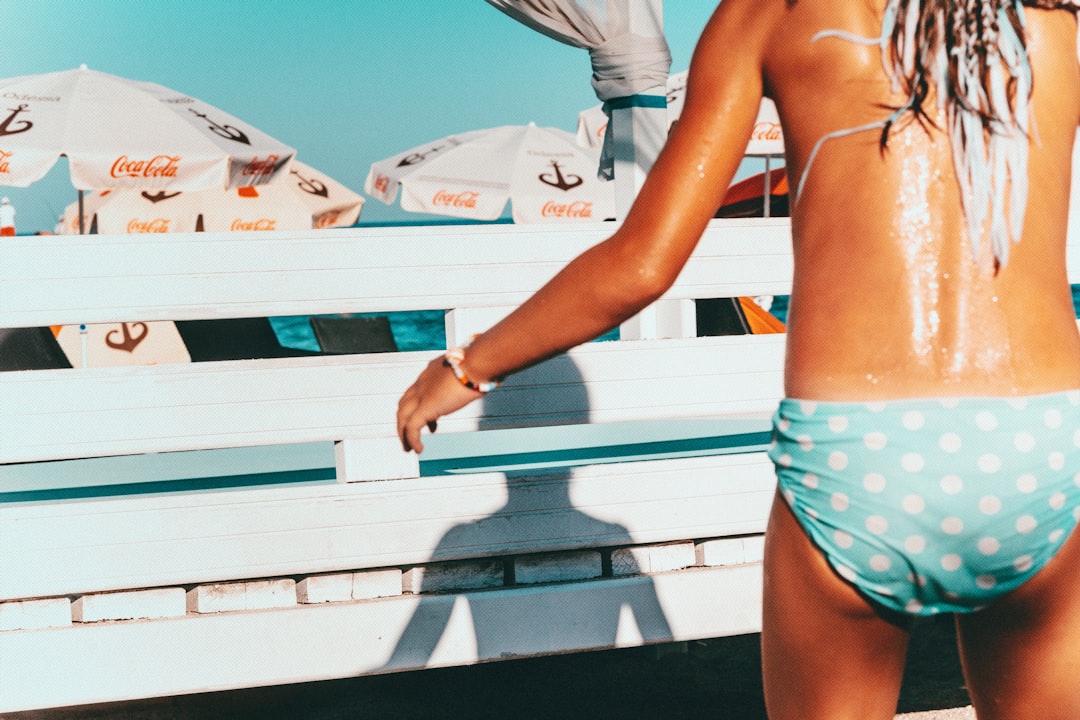
Vintage Polka Dots
Polka dots are returning with a 1950s pin-up sensibility, but executed in modern cuts. Cherry red dots on cream, navy dots on butter yellow, black dots on rose. They look retro in a hanger photo and surprisingly contemporary on a real body, especially when paired with high-waisted bottoms or a bandeau top. They’re also one of the most photogenic prints — the dots create instant visual interest in any image, which is why they tend to do well on social. A polka dot set is one of those buys that ends up in nearly every beach photo you take that year.
How to Choose Colors That Flatter Your Skin
Picking a 2026 shade doesn’t have to come down to memorizing warm vs cool tone charts. A simpler test: hold the suit up to your face in natural daylight. If your skin looks brighter and your eyes look more awake, the color is working for you. If your face suddenly looks tired, gray, or washed out, the shade is fighting you. This test bypasses the whole undertone debate and gets you a real answer in under a minute.
Also: trust how you feel in a color, not just how you look in it. Confidence carries any swim piece further than the “right” shade ever will. If a bright coral makes you stand a little taller when you put it on, that’s a stronger argument than any seasonal palette guide.
Mixing and Matching Prints Without Looking Chaotic
The fastest way to make 2026’s color story work for you is to buy separates and remix them. A solid butter-yellow top can wear with watercolor floral bottoms, then later with marbled green bottoms. The rule of thumb: when you mix two prints, both should share at least one color. If your top has hints of pink in its print, your bottoms should also carry a pink, even if their dominant color is different. That shared thread is what keeps a mixed look from sliding into chaos.
When in doubt, anchor one piece in a solid color and let the other do the visual lifting. That’s a much easier formula than trying to coordinate two equally loud prints, which usually ends in regret somewhere between the dressing room and the beach.
Shop Mix-and-Match Bikini Separates on Amazon →
Building a Versatile 2026 Bikini Wardrobe
You don’t need ten bikinis to ride the 2026 trend. A capsule of three or four pieces will cover most needs without overflowing the swim drawer:
- One solid in a 2026 hero shade — butter yellow, sage green, or wine
- One watercolor floral or marbled print for statement days
- One classic black or white piece for days when you want zero fuss
- Optional: one polka dot or pastel set for when you want a softer, more romantic look
Treat each piece like an outfit-builder rather than a single use, and the whole wardrobe earns its keep across a full summer. Three thoughtful pieces will get more wear than ten impulse buys, and they photograph better because nothing in the rotation feels like an afterthought.
The Takeaway
The trending colors and patterns 2026 has on offer are friendlier than they look in the runway photos. The shades are softer than past color cycles, the prints are more wearable than the bold florals of the late 2010s, and the silhouettes are being designed with more body shapes in mind. The best move this season is to pick one color you’ve never tried and one print that feels just a little outside your comfort zone. That’s how a swim wardrobe stays interesting, and that’s how you actually enjoy the trends rather than just watching them go by.
Sources
- Pantone — color forecasting authority
- Vogue — runway and trend coverage
- Wikipedia: Swimsuit — history and styles of swimwear
- WGSN — trend forecasting platform
Shop our full range of bikinis and swimwear at the BikiniCool store →