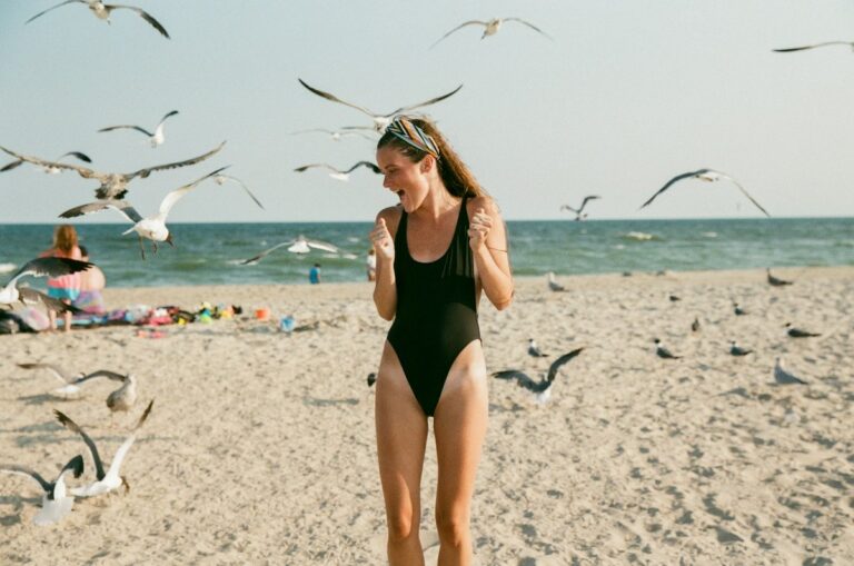
Hot Hues & Bold Prints: Styling 2026 Swimwear Trends With Confidence
Trends used to feel like rules. In 2026, they read more like invitations — soft suggestions about which colors and prints the world wants to see by the water. The smart move isn’t chasing every shade that hits a runway. It’s understanding the palette, the prints, and how to translate them into pieces that actually look good on the body you’re standing in right now.
This guide walks through the trending colors and patterns 2026 swimwear collections are leaning into — but spends most of its time on the part that matters more: how to wear them. Skin tones. Body shapes. Mixing prints without looking like a thrifted couch. Building a small swim capsule that travels, layers, and lasts. Whether you’re refreshing one bikini or rebuilding your entire beach drawer, the goal is the same. Pick the trends that work for you. Skip the ones that don’t.
The 2026 Swim Palette in One Glance
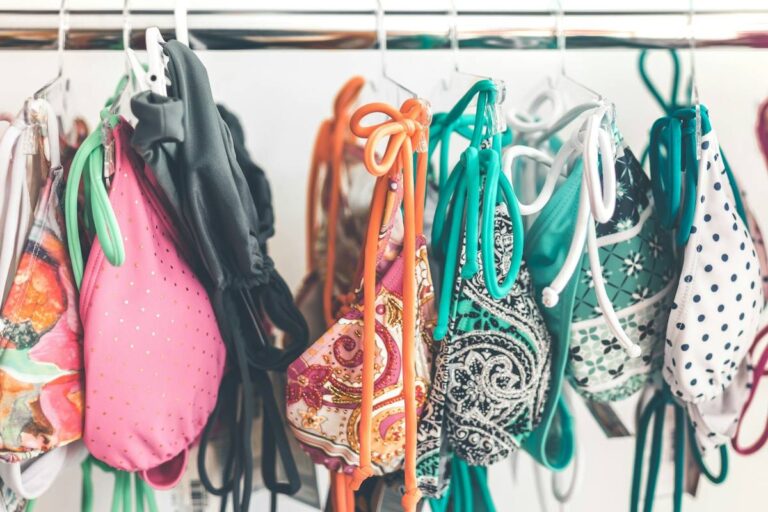
Before you can wear a trend well, you need to know what’s actually on the trend board. The 2026 swimwear color story is warmer and softer than the saturated neons of recent years, with a few high-voltage exceptions for anyone who refuses to whisper.
The headline colors landing in spring and summer drops:
- Butter yellow — the softest, most universally flattering yellow in years
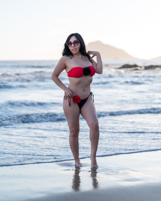
- Fuchsia and hot pink — still here, now leaning slightly raspberry
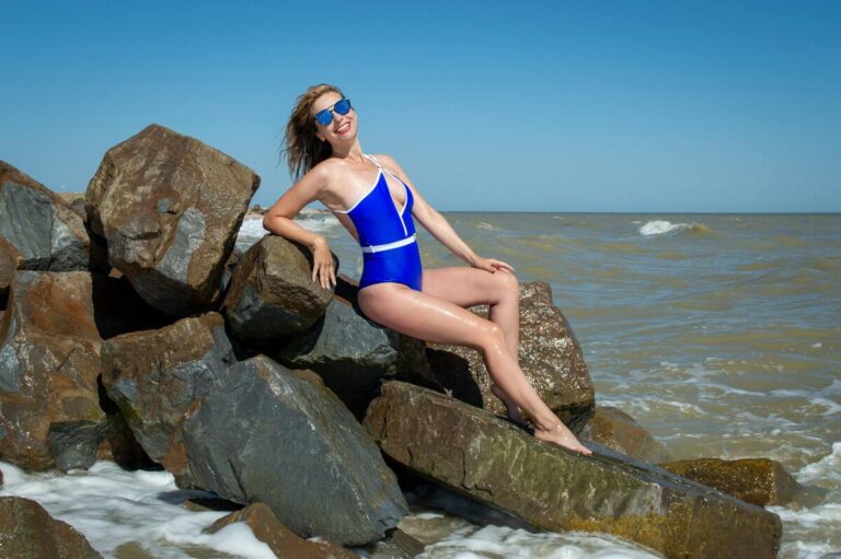
- Marine and ink blue — the navy update, deeper and richer
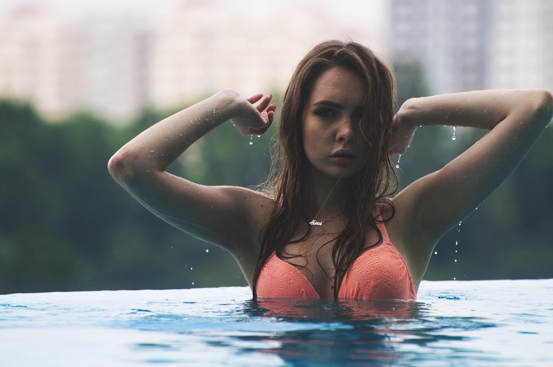
- Tangerine and warm coral — sunset shades that photograph beautifully
- Sage and seafoam — quiet greens that flatter almost every undertone
- Optic white — back, structured, and very clean
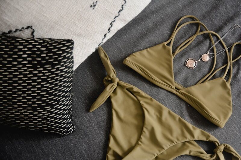
- Sand, shell and ecru — the new neutrals replacing flat black
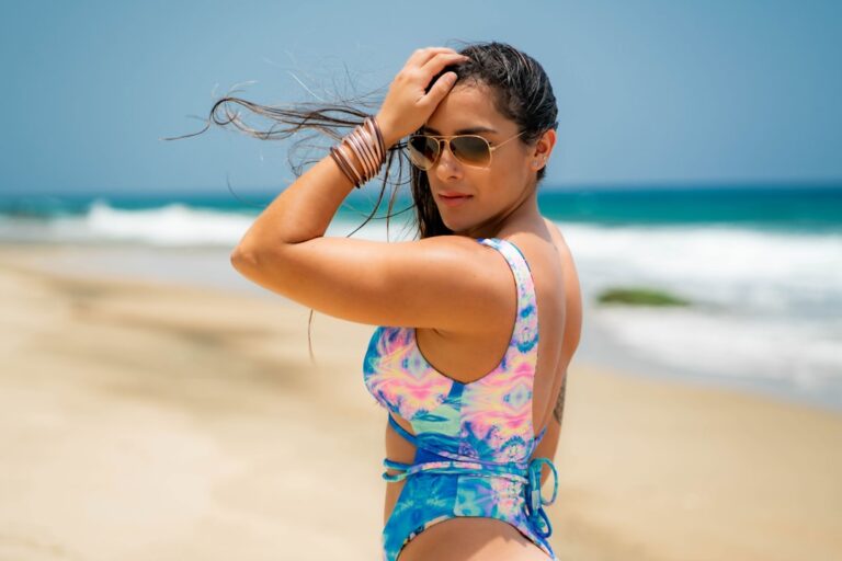
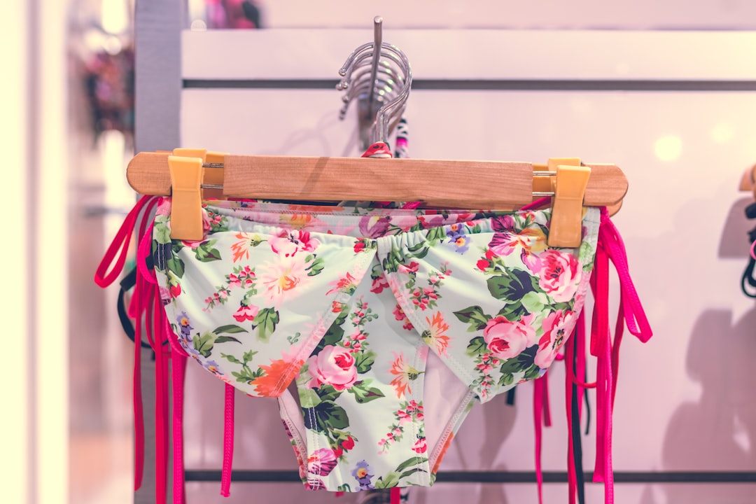
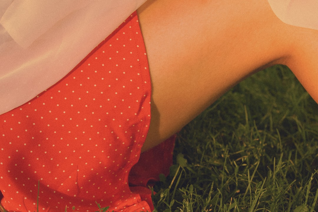
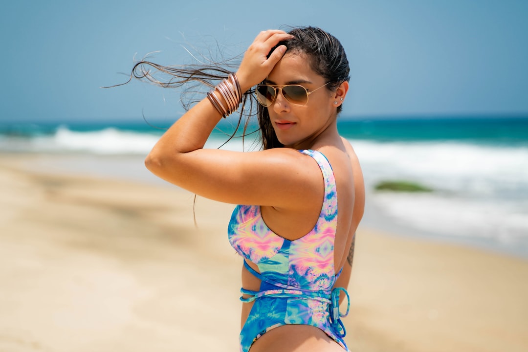
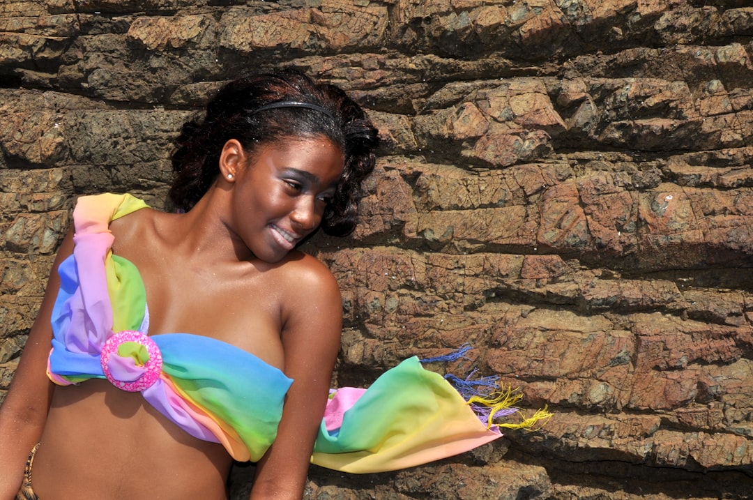
On the print side, expect oversized watercolor florals, retro polka dots in two sizes (tiny and tablecloth), abstract brushstrokes that look hand-painted, a ditsy gingham revival, and color-block panels that read sportier than they actually are. Animal prints are quieter than last year, mostly shaped like soft snake or blurred giraffe.
Match the Hue to Your Undertone (Not the Influencer)
The fastest way to wear a trending color badly is to pick the version that suits someone else’s skin. Every shade on the 2026 palette has warm and cool variants. Knowing your undertone tells you which side of the swatch to shop.
The 10-Second Undertone Check
Flip your wrist over in natural light and look at the veins under your skin. Green-leaning veins usually mean warm undertones. Blue or purple veins suggest cool undertones. If you genuinely can’t tell, you’re likely neutral — congratulations, almost everything works for you.
Warm Undertones
If your skin has golden, olive or peachy warmth, the 2026 palette is loaded with gifts. Butter yellow, tangerine, warm sage, terracotta, shell and ecru will all glow on you. Lean into the print colors with a yellow or orange base. Avoid icy pastels and blue-based whites — they’ll make you look tired in photos even when you feel great.
Cool Undertones
Pink, blue and red undertones thrive in fuchsia, marine blue, optic white, true cool black and the raspberry side of pink. Seafoam works beautifully too. Skip the mustard-leaning yellows and warm terracottas — they tend to pull the color out of cool skin instead of bouncing light back up.
Neutral Undertones
Neutral skin can wear almost the entire 2026 palette. Use saturation as your dial instead of hue. If you want to look softer, pick the dustier, more washed-out versions of trending colors. If you want maximum impact, go saturated — full fuchsia, deep marine, true tangerine.
Patterns Without the Overwhelm
Bold prints are everywhere this year, but bold doesn’t have to mean loud. Each of the trending 2026 patterns has a quieter and louder version. Pick the one that matches your comfort level, not the one your camera roll thinks you should wear.
Oversized Florals
The big bloom is back. Look for prints where individual flowers are bigger than your palm. They photograph beautifully and they balance fuller hips or a smaller bust visually, because the eye reads the pattern instead of measuring the body. Wear them as the single statement piece in a look — pair with solid bottoms or a plain cover-up.
Watercolor Blurs
Watercolor prints look painterly and feel softer than a hard floral. They’re the easiest “pattern” to wear if you’re print-shy because the edges blend, the color story is usually two or three hues, and they read calm from a distance.
Retro Polka Dots
Two scales are trending. Tiny dots on a fitted triangle bikini read sweet and a little vintage. Big dots — coin-sized or larger — read editorial and graphic. Pick a scale that matches the mood you want, not just the silhouette you’ve always worn.
Brushstroke Abstracts
Hand-painted-looking strokes, splatters and broken stripes are the print to watch this year. They feel artsy without leaning into anything specific, which means they age better than a print tied to a single trend cycle.
Ditsy Gingham
Gingham is the sleeper print of 2026, mostly in micro-checks and in two colorways: classic red-and-white and a fresh sage-and-cream. It works almost like a neutral and pairs surprisingly well with bigger prints when you want to layer.
Pattern Mixing Rules That Actually Work
Mixing prints in swimwear is having its moment — mismatched bikini tops and bottoms in two different patterns, or a printed bikini under a contrasting printed cover-up. It can look styled or it can look chaotic. The difference is usually three small rules.
- Anchor with a shared color. Two prints can be wildly different in shape if they pull from the same color story. A big floral and a polka dot will hang together if both contain butter yellow.
- Vary the scale. If one print is big, the other should be small. Two large-scale prints together compete. One big and one tiny look intentional.
- Pick a lead. One pattern is the main character. The second is the supporting role — quieter, smaller, or in a single color from the first.
If you only remember one thing: shared color, different scale. That single combo will get you through almost every mixed-print outfit you try.
Styling 2026 Trends for Real Bodies
Trend reports rarely admit it, but every color and print on the runway behaves differently on different bodies. The good news: most of the 2026 stories are easy to flatter once you know which dial to turn.
- Fuller bust: Larger prints distribute the visual weight better than tiny prints. A big floral on a structured top reads balanced. Avoid scratchy busy micro-prints that pull focus to the chest.
- Smaller bust: Horizontal stripes, ruffles and ditsy gingham add the illusion of volume. Butter yellow and pastel watercolor prints also read soft and feminine without needing padding.
- Fuller hips and thighs: Solid bottoms in trending colors are your best friend — marine blue, sand, sage. Pair with a printed top to draw the eye up. High-waisted cuts in trend colors give a smoothing, body-positive silhouette.
- Longer torso: Color-block one-pieces with horizontal panels break up the visual length nicely. Pattern mixing with a different-color top and bottom also visually shortens.
- Shorter torso: Vertical brushstroke prints and solid-color one-pieces lengthen the line. Avoid horizontal stripes through the middle.
- Soft tummy: Watercolor and abstract prints are forgiving because they blur the eye’s tracking. A high-waisted bottom in a trending solid plus a busy top works beautifully.
Trends don’t owe you flattery — but you don’t owe them obedience either. Pick the ones that make you feel good in a mirror at 9 a.m. on a regular Tuesday, not just the ones that look great on a model in studio lighting.
Build a 5-Piece 2026 Swim Capsule
You don’t need ten bikinis. You need five pieces that mix, layer and travel. Here’s the capsule built entirely around 2026’s trending colors and patterns — designed to give you at least twelve different looks from five items.
- The print statement. One oversized floral or watercolor bikini that does the work. This is your hero piece and the one you’ll photograph most.
- The trend-color solid one-piece. Pick the one trending color you wear best — butter yellow, fuchsia, marine, or sage — in a flattering one-piece silhouette.
- The neutral basic. A sand, shell or ecru bikini that pairs with everything, including your printed cover-ups. This is your travel workhorse.
- The mix-and-match top. A second top, ideally in a small-scale pattern (ditsy gingham, micro polka) that pairs with both your hero print bottoms and your solid bottoms.
- The throw-on layer. A linen kimono, gauze shirt, or sarong in a trending neutral or a watercolor print. Beach-to-cafe in one move.
That’s the full kit. Five pieces, five colors from the 2026 palette, three different prints, and enough combinations to get you through a long weekend or a two-week vacation without anyone noticing you’re rotating.
Your 2026 Swimwear Refresh Plan
If you’d rather not overhaul the whole drawer, here’s the smallest move that still makes your swim wardrobe feel current.
- Audit what you own. Lay it all out. Note which colors still flatter you and which feel dated or worn.
- Pick one trending color. Just one. The one that matches your undertone and makes you feel something positive when you look at it.
- Add one print. A watercolor, oversized floral, or polka dot — whichever feels least scary.
- Add one cover-up. A linen layer in a neutral from the new palette ties everything together.
- Donate or retire two old pieces. The faded triangle from three summers ago is not coming back. Let it go.
Three small purchases. Two retirements. One refreshed swim drawer that feels intentional instead of accidental. That’s the whole 2026 trend pivot, no overhaul required.
Trends are useful as a map. They’re terrible as a master. The 2026 palette is genuinely flattering — softer, warmer, more wearable than recent years — and the prints reward a little bravery without demanding it. Take what works for your skin, your body and your real life. Leave the rest on the runway.
Sources
- Pantone Color Institute — seasonal color forecasting and palette references
- Vogue — runway and resort coverage informing seasonal swim trends
- Color Theory — Wikipedia — undertone and color harmony background
Shop our full range of bikinis and swimwear at the BikiniCool store →