Pink Bikini: 9 Best Styles for 2026
Peony pink overtook neon as the shade celebrities actually wear to the beach this year, and the shift shows up in search data and retail buys alike. Unlike the hot-pink spike of a few summers ago, 2026’s version splits into two camps: a louder fuchsia for people who want to be seen, and a softer blush for people who don’t. Both are selling. The question isn’t whether pink works — it’s which pink works on you, and in which cut.
Why Pink Took Over the Swimwear Racks This Year
Peony pink is the shade the color forecasters kept circling back to for 2026, and it’s already been worn by Kylie Jenner, Bella Hadid, and Selena Gomez on vacation posts that got picked up by fashion press[1]. What’s different from the last hot-pink wave is the range — brands are selling both the loud fuchsia and a much quieter blush side by side, and customers are buying both instead of picking a lane. Structured pieces like underwire tops and cutout one-pieces are where the saturated fuchsia shows up most, because the fabric’s rigidity holds the color without it looking like it’s bleeding into soft folds. Pair that with metallic hardware — gold rings, rose gold chain straps — and the look reads expensive instead of candy-colored.
None of this means every pink works the same way in every cut. A triangle top in blush reads delicate. The exact same shade in a structured bandeau reads polished. The fabric and construction change what the color says about you before anyone even clocks the style.
The 9 Best Pink Bikini Styles for 2026
These are ranked by how often they’re actually selling right now, not just what’s trending on a runway. A few assume you already own a pink piece and want a second cut; most are starting points.
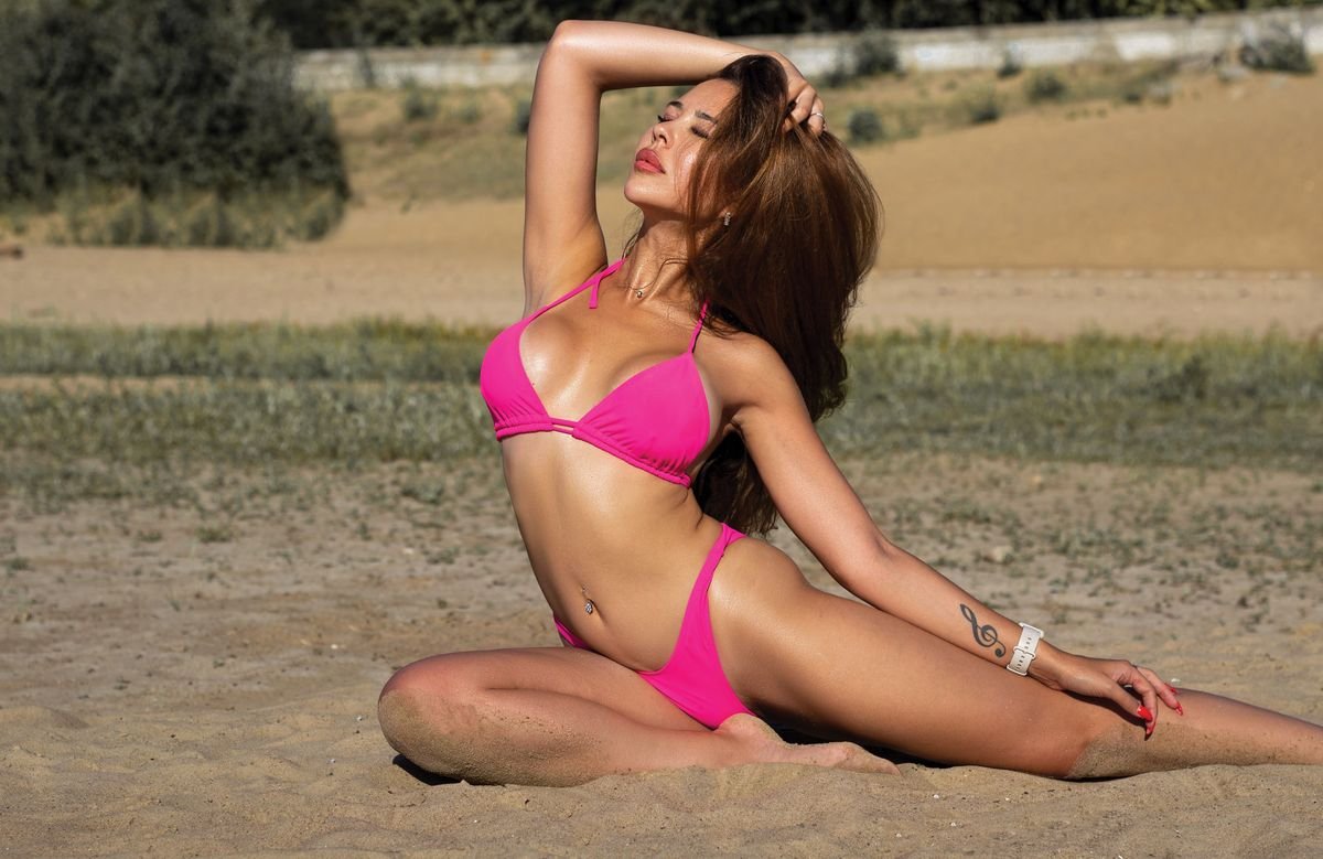
1. Solid Hot Pink Triangle
The simplest version is still the best-seller. A solid saturated pink triangle top with minimal hardware puts the color front and center without competing prints or cutouts. It’s also the easiest to mix into a wardrobe — one hot pink top pairs with black, white, or denim bottoms just as easily as its matching set.
2. Ruffled Bandeau
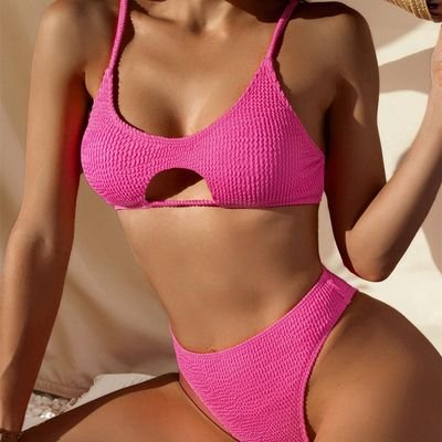
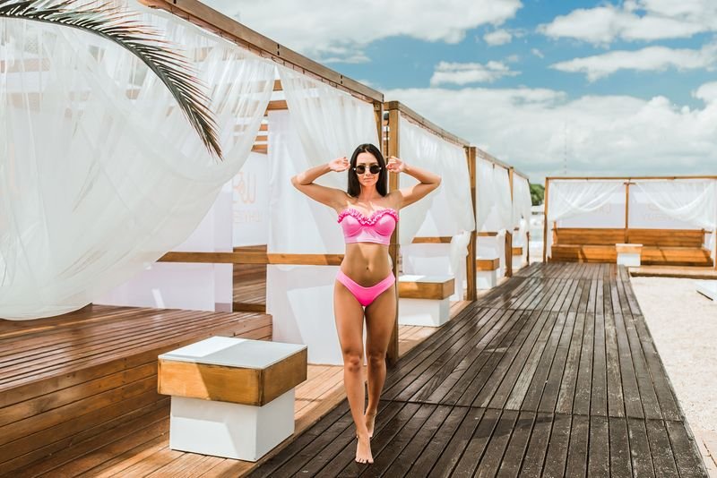
A strapless bandeau with a ruffled edge is the “romantic” lane of pink swimwear this year — it photographs well standing still but needs a halter conversion strap for anything more active than floating. If you’re deciding between a bandeau and a different strapless cut, the full bandeau fit guide covers which body types it actually supports versus just suits visually.
3. High-Waisted Classic
Pink is one of the few colors where the high-waisted cut doesn’t read as “modest default” — the contrast between a high-rise bottom and a bright top keeps the silhouette from looking shapeless. It’s also the most forgiving cut for showing a flat stomach versus a curved one, which is why it keeps dominating this site’s best-seller list regardless of color; see the dedicated high-waisted bikini styles guide for cut-by-cut differences.
4. Pink Animal Print
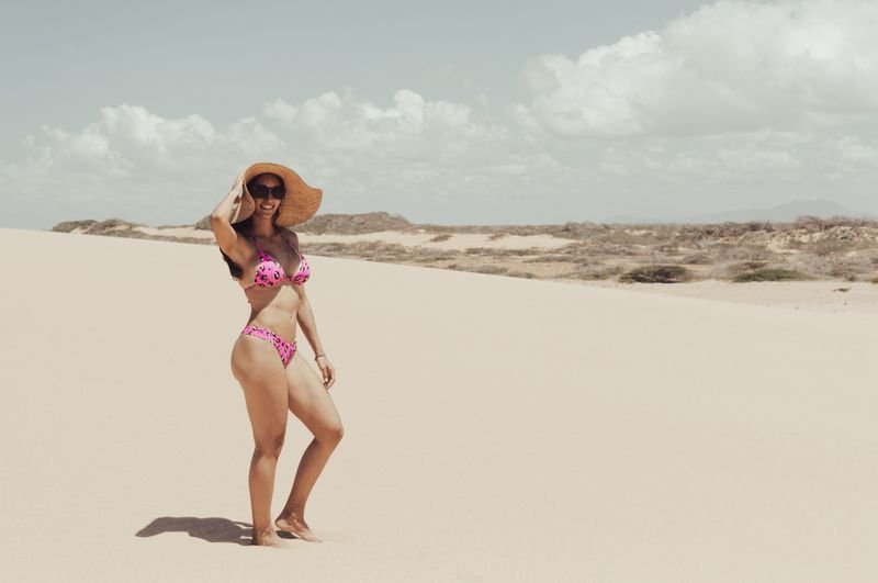
Leopard and zebra prints rendered in pink instead of the usual brown or black tones are one of the few animal-print variations that doesn’t read as aggressive. The pattern does the visual work, so the cut can stay simple — triangle or bandeau, nothing structural. For the full range of print-on-print combinations this site has already tested, the animal print swimwear roundup has seven more looks.
5. Pastel Sporty Set
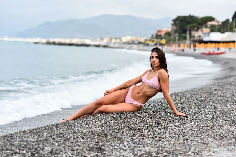
A scoop-neck pastel pink bikini top built like a sports bra, usually paired with high-cut bottoms, is the version built for actually swimming laps or playing beach volleyball instead of lounging. The fabric is heavier and the straps are wider, which means less adjusting mid-activity and more fading resistance than the sheer, lightweight fabrics used for the softer blush pieces.

6. Polka Dot
Pink-and-white polka dot is the retro lane — it borrows from 1950s swimwear silhouettes but in a 2026 cut, usually a scoop top with a high-waisted or Brazilian-cut bottom. It reads more playful than sexy, which makes it the easiest pink style to wear to a family beach day without a second thought.
7. Cutout Monokini
A single-piece pink monokini with side or waist cutouts gives you the coverage of a one-piece with the visual lightness of a two-piece. In pink specifically, the color makes the cutout read as a style choice rather than a “trying to look smaller” choice, which is the usual criticism leveled at cutout one-pieces in darker colors.
8. Textured Ribbed Pink
Ribbed or crinkle-textured fabric in pink does something flat pink can’t: it catches light differently depending on the angle, which makes the color look richer in photos and less flat in person. It’s a small fabric choice that changes how saturated the same dye looks once it’s wet.
9. Pink Color-Block
Pairing a pink panel against green, orange, or black in a single set is the style most likely to work on a body-positive range of shapes, because the contrasting block can be placed exactly where you want visual attention to land — center panel for a flatter stomach read, side panel for a waist-defining line.

The One Thing to Check Before You Buy a Light Pink Suit
Pale pink and blush fabrics go sheer when wet far more often than darker colors, because there’s less dye pigment blocking light through the fabric to begin with. A suit that looks perfectly opaque dry can turn translucent the second you’re out of the water, especially around the bust and seat where the fabric stretches thinnest. Before buying a light pink piece online, check the product photos for a wet-fabric or pool shot specifically — if every photo is dry, that’s a gap worth asking the seller about rather than assuming it’s fine.
Two fixes if you already own one and it’s an issue: a built-in or sewn-in liner in a matching or nude shade solves it without changing how the suit looks from the outside, and darker pink shades (fuchsia, magenta, hot pink) simply don’t have this problem the way blush and baby pink do — so if sheerness is a dealbreaker, lean toward the saturated end of the color rather than the pastel end.
Which Shade of Pink Actually Works for Your Skin Tone
Undertone matters more than depth of skin color here. If you have fair skin with cool, pink undertones, a plain baby pink tends to flatten against your complexion because there’s no contrast — cool-toned fuchsia, shocking pink, or magenta create the contrast baby pink can’t[2]. If your fair skin runs warm, coral-pink does what baby pink can’t on you either, adding warmth instead of competing with it.
On tanned or deeper skin, the math flips: coral and floral-pink prints sit well against a tan because the warmth in both colors matches, and a bold neon hot pink reads as a highlight against deeper skin rather than overwhelming it the way it can on very fair skin. The rule that holds across skin tones is contrast, not matching — a pink that’s close to your exact skin shade will always look washed out next to one with enough depth to stand apart from it. This site’s broader bikini colors for skin tone guide walks through the same logic for every other shade if pink isn’t the one you land on.
How to Style a Pink Bikini So It Doesn’t Read as “Try-Hard”
The fastest way to undercut a bold pink is to put it next to a lot of other bold color. Gold or rose-gold jewelry works because metal reads as neutral no matter how saturated the fabric is next to it — the same reason stylists keep pairing peony pink with metallic hardware this season[1]. A neutral cover-up (white linen, tan sarong, black mesh) does the same job for the walk from beach to bar: it lets the bikini be the loud piece instead of competing with a second loud piece on top of it.
Sunglasses and hats are the easiest place to go neutral if the rest of your look already leans bright — a tortoiseshell or black frame grounds a hot pink set faster than a matching pink hat ever will. And if you’re self-conscious about a bright color drawing eyes to a specific area, the color-block and ribbed-texture styles above are built to redirect that attention on purpose rather than hoping a cover-up does it for you.
Why That Hot Pink Fades Faster Than You’d Like (and How to Slow It Down)
Chlorine is an aggressive oxidizer — it doesn’t just sit on fabric, it actively breaks down the dye molecules bonded to the fibers, and sunlight does the same thing to the fibers themselves through UV exposure[3]. A lab study tracking swimwear fabric under combined chlorine and sun exposure found fabric strength dropped by 65% after 300 hours of exposure — roughly a season and a half of regular pool use[3]. Bright, saturated colors like hot pink don’t necessarily degrade faster than any other color chemically, but any shift away from the original shade is far more visible on a loud color than a muted one, so fading shows up sooner to the eye even when the underlying damage rate is the same.
Three habits buy real time: rinse the suit in cool fresh water immediately after chlorine or saltwater exposure instead of waiting until you’re home, skip the dryer entirely, and never leave it to dry balled up in direct sun — lay it flat in shade. None of that stops fading completely, but it’s the difference between a pink suit that’s still vivid in August and one that’s gone chalky by July.

Pink isn’t a trend you need to catch before it passes — between the fuchsia and blush splits selling side by side this year, there’s a version of it that will outlast the season. Pick the undertone that actually works against your skin before the cut, and the bikini does the rest of the work for you. If you’re still deciding on a different color family, the 2026 bikini color and pattern forecast breaks down what else is trending this year.
Sources
- Who What Wear — Bikini Colour Trends Summer 2026 — reporting on peony pink and metallic styling trends for 2026 swimwear.
- SimplyBeach — Swimwear Colours for Fair Skin Tones — guidance on cool versus warm undertone matching for fair skin.
- PMC — The Impact of Chlorinated Water and Sun Exposure on the Durability and Performance of Swimwear Materials — lab data on fabric strength loss from combined chlorine and UV exposure.